The page has been designed and written by Ayumi Ozeki ozekia@gmail.com
go to home http://ayumi01.s3-website-us-east-1.amazonaws.com
Financial data visualization
Excel charts are everywhere. The ease of creating
them as if caused the flooding of horrible presentation that leaves viewers
spending quite an effort trying to comprehend what is even shown.
A little trick in custom formatting can convert what might be a difficult to follow chart
to something that tells a story instantly. Default charts vs. customized
versions are shown to illustrate such point.
This table has been created based on the yield data
available from treasury.gov Resource
Center. It’s nothing but the yield curve changes from 1/2/19 to 8/1/19.
Table
1.a – US Treasury yield
|
1 mo |
2 mo |
3 mo |
6 mo |
1 yr |
2 yr |
3 yr |
5 yr |
7 yr |
10 yr |
20 yr |
30 yr |
|
|
1/2/19 |
2.40 |
2.40 |
2.42 |
2.51 |
2.60 |
2.50 |
2.47 |
2.49 |
2.56 |
2.66 |
2.83 |
2.97 |
|
2/1/19 |
2.41 |
2.42 |
2.40 |
2.46 |
2.56 |
2.52 |
2.50 |
2.51 |
2.59 |
2.70 |
2.88 |
3.03 |
|
3/1/19 |
2.44 |
2.46 |
2.44 |
2.52 |
2.55 |
2.55 |
2.54 |
2.56 |
2.67 |
2.76 |
2.97 |
3.13 |
|
4/1/19 |
2.42 |
2.43 |
2.43 |
2.46 |
2.41 |
2.33 |
2.29 |
2.31 |
2.40 |
2.49 |
2.71 |
2.89 |
|
5/1/19 |
2.42 |
2.41 |
2.43 |
2.44 |
2.39 |
2.31 |
2.28 |
2.31 |
2.41 |
2.52 |
2.74 |
2.92 |
|
6/3/19 |
2.36 |
2.36 |
2.35 |
2.31 |
2.11 |
1.82 |
1.79 |
1.83 |
1.95 |
2.07 |
2.34 |
2.53 |
|
7/1/19 |
2.17 |
2.16 |
2.21 |
2.10 |
1.94 |
1.78 |
1.74 |
1.79 |
1.90 |
2.03 |
2.34 |
2.55 |
|
8/1/19 |
2.11 |
2.14 |
2.07 |
2.04 |
1.88 |
1.73 |
1.67 |
1.68 |
1.77 |
1.90 |
2.21 |
2.44 |
Default Excel chart vs. customized version:
From Table 1.a, the
following charts have been created using built-in Excel line chart tool without
any modification in formatting at all:
|
Chart 1.a |
Chart 1.b |
|
|
|
Compare above to the
following customized version:
|
Chart 2.a |
Chart 2.b |
|
|
|
Comparing the two:
Default format: After selecting the data
table in Excel, go to “Insert” and “Recommended Charts”, select “All Charts”
tab and select “Line” (type), you see these charts presented. You can copy
Table 1.a and paste into Excel and try yourself.
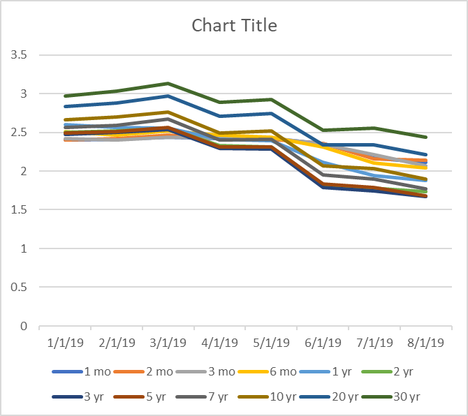
Chart 1.a shows yield change at each
term over time. This chart is particularly busy and it requires quite an effort
to understand what is going on. For example, “3 yr” and “20 yr” are both dark
blue. While these two appear darker than “1 mo” within legend section, it’s
difficult to tell which line is among these three within the main chart itself.
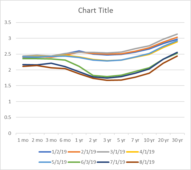
Chart 1.b shows a yield curve changes
over time. This is what one would see typically. While this is less busy than
Chart 1.a, it’s very hard to comprehend what is going on. Three lines that show
low yields probably attract attention while the rest is cluttered busily above.
Other than that, you have to try very hard to read this chart.
While both charts show something that the Table 1.a
does not, the fact the reader has to try very hard to understand is a
fundamental problem that almost defeats the purpose of showing charts. In
real-life (i.e. paying Wall street jobs) charts circulated, whether analytic
report, stress-test report, anything, are almost exclusively with such default
color schemed charts.
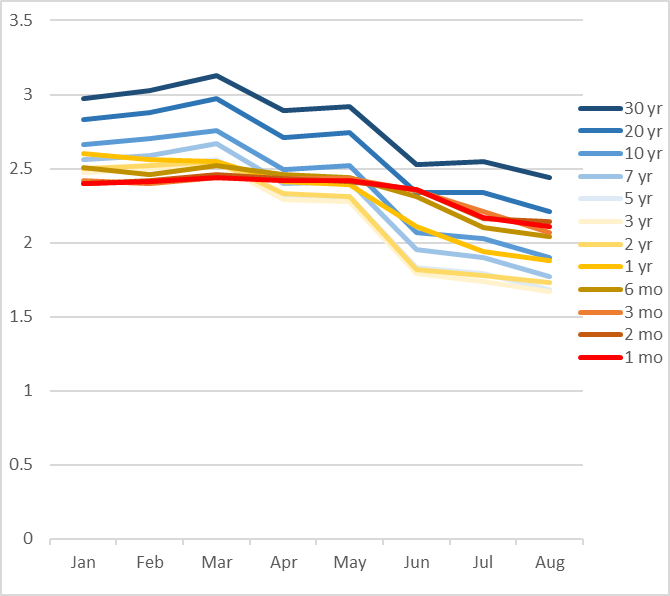
Custom format: The same charts have been reformatted from within
Excel. All of a sudden stories visually emerge. The following changes have been
made from the original default format:
-
Line colors have been changed so that changes from short-term to longer
term, from January to August, are very easy to follow
-
Moved the legend to the right, making it easy to link the lines in the
main area vs. the legend
-
Chart title has been deleted
-
X-axis labels and format have been changed so that it is less cluttered
In both enhanced charts, color scheme is such that
you pay attention to red and dark blue as starting and ending points. The new 2.a
makes it very clear that the short term rates remained relatively stable but
longer term made sharper decline – the story nearly impossible to see in the
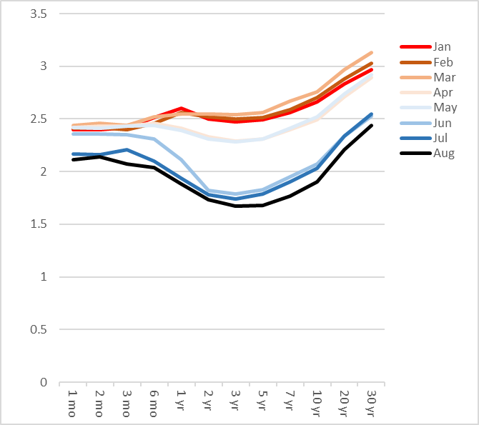
original default format. 2.b also shows something new – early this year the
curve vibrated within a narrow range, but all of a sudden the second quarter
dramatic changes started to happen in terms of the rates and the shape of the
curve. While 1.b showed two clusters of the curves how and when curves changed
was extremely difficult to see. With color coding in 2.b, one can follow the
transition from January all the way to August in terms of both level of rates
and the shape.
Data table enhancement
Excel’s built-in conditional formatting feature further aids in
comprehension of the data. Below is the same data table with conditional
formatting applied:
Table 1.b
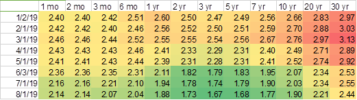
Together with custom formatted charts, transition of the term structure
across time as well as how each term changed relative to others are a lot
easier to understand. In a way Table 1.b can tell stories from both Chart 2.a
and 2.b in one shot since the reader can slice this table in both vertically and
horizontally, which is equivalent of Chart 2.a and Chart 2.b, respectively. Of
course showing all three will be the best
My thoughts
Having done CCAR multiple cycles myself, I have seen far, far worse.
Yield curves for so many forecasted quarters across various stress scenarios
are shown in one huge chart without any custom formatting. When an analyst was
explaining a story at a conference call, all the listeners including myself
were too busy just trying to understand which line color represented what and
even after understanding it the story was never seen from ugly chart. In the
end the recipients of the presentation ended up spending more time just trying
to comprehend the chart schematics yet the chart hardly tells a story visually.
Charts are actually nothing but distraction.
Visualization of information is considered to be a very important
transformation and translation of massive data to aid human being processing
critical take-aways. Yet poorly constructed and presented charts end up
creating another pile of information junk which should have never been done in
the first place. If you show charts, make sure they are very clear and easy to
comprehend. If charts are not easy to follow, don’t bother – recipients get too
busy just trying to understand the schematics and don’t have enough time to
read into the stories.
The
last update: 8/18/2019
The
page has been designed and written by Ayumi
Ozeki ozekia@gmail.com
go
to home http://ayumi01.s3-website-us-east-1.amazonaws.com