The page has been designed and written by Ayumi Ozeki ozekia@gmail.com
go to home http://ayumi01.s3-website-us-east-1.amazonaws.com
FX technical analysis
This took place before online chart services were
readily available. I joined Chase FX trading as an analyst to support technical
analysis among other things. Here “technical analysis” means recognition of
price patterns and determination of key price points to watch out for, as well
as monitoring of the markets trend. While I learned at a business school that
technical analysis would not work, and I had believed as such, I immediately
realized it played a critical role for trading. Regardless, Chase FX had
hundreds of clients world-wide ranging from corporate, broker/dealer, and
central banks among others. The technical analysis team (that I was part of)
and economic analysis team were sending daily report via fax.
When I started the job, the process of creating the
report was as follows – literally manual:
1.
Print hourly charts of major currencies from a terminal. The screen
configuration and print format had to be preset
2.
Cut (with scissors) the printout to a size, roughly two thirds of the
page, and paste on top of a blank paper
3.
At the bottom of the page, hand-write commentary. Add line and price
points to the charts as necessary (again with hand)
4.
Make a photo copy of the assembled report
5.
Fax the copied report to clients world-wide; also made additional photo
copies for daily morning meeting
Basically the report look as below:

Click this link to see the photo
image of the original manual report.
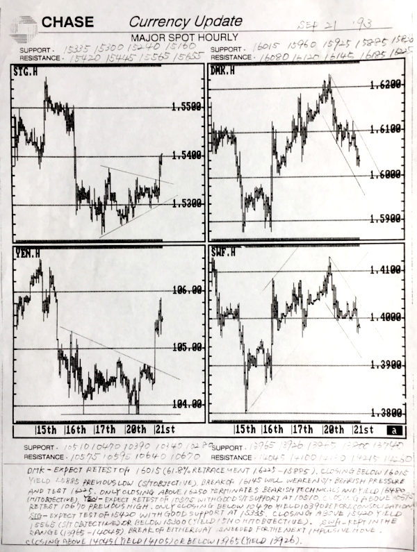
The cover page was always the hourly charts of the
major currencies, followed by additional reports. They were all created
manually with scissors and by hands.
The report was getting pretty good review as
reflected in the Euromoney survey. However an
opportunity to make it all electronic was obvious. Right around that time the
object linking and embedding was becoming available from Microsoft. What it
meant was that we could store the data series in Excel, create chart, and embed
it within Word document. Today this is no big deal but again note that this
feature was brand new back then people were happy with our hand-written
reports.
Long story short, below is a totally revamped
report. The routine got changed considerably:
1.
Before I went home, I updated all the chart data points in Excel, and
in the linked Word document drew lines and boxes with prices
2.
Given the activities that has taken place in New York markets, wrote
commentary
3.
In the morning of the report publication, as I came into the office
update Excel data series and charts in Word to reflect early London markets
activities
4.
Check the commentary to see any changes required given the London
activities. Add additional price points should drastic changed in markets had
taken place
5.
My boss to finalize commentary
6.
Once files were all updated, print; it was ready to send to clients world wide as well as for daily 7:30 staff meeting
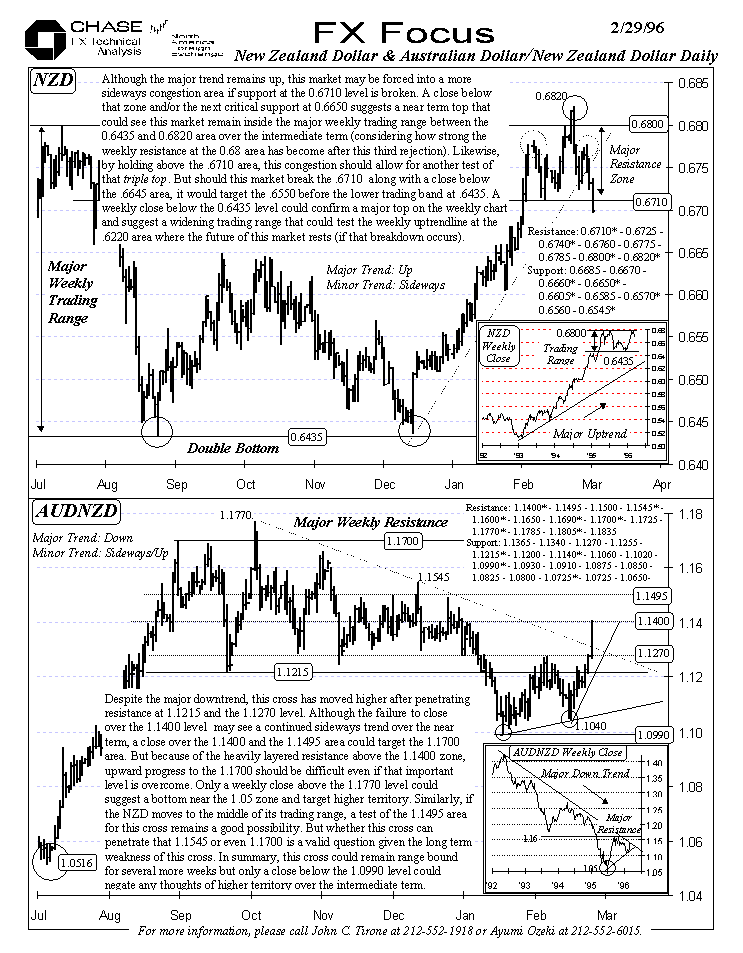
Subsequent to the upgrade in the chart formats we got
even more votes in the Euromoney survey and ranked number one two years in a
row as the best FX technical services. I applied the same idea for all the clients presentation where PowerPoint embedded linked charts
so that update could be done instantly. I recall we had one client meeting
where I had to update the charts shortly before the presentation to reflect
extremely volatile London activities. While this is no big deal today where we
can check anything on our Smartphone back then people were not used to see
PowerPoint presentation that included nearly real time data.
Changes
Our wonderful FX technical analysis days did not
last too long as the bank was acquired by Chemical bank (later became JPMorgan
Chase). First we were told by the corporate marketing
team to include the top banner for all the publications. It messed up our
document formatting. What troubled me most was the wasteful usage of the
limited page real-estate. As you can see from the above chart example, it used
empty space as much as possible so that the charts can be shown as large as
possible. In fact, the original hand-written version had exactly this problem;
charts on the top, commentary on the bottom. The new electronic version
enlarged charts as big as possible so that readers can clearly see the pattern.
The post merger logo mandate ended up limiting the
real-estate and from my perspective diminished the effectiveness of the report.
In the end both my boss and I were let go since our job functions were
terminated.
The
last update: 9/3/2018
The
page has been designed and written by Ayumi
Ozeki ozekia@gmail.com
go
to home http://ayumi01.s3-website-us-east-1.amazonaws.com