The page has been designed and written by Ayumi Ozeki ozekia@gmail.com
go to home http://ayumi01.s3-website-us-east-1.amazonaws.com
Corporate logo and homepage development
I had an opportunity to design the logo and
marketing materials for a startup. In retrospect the idea was to offer a cloud FX trading service for small
regional banks. It was 2002 when my big boss from my days at Chase Manhattan FX
trading contacted me out of blue. He asked me to design the corporate logo and
home page for his startup. The value proposition was to offer FX trading
capabilities for small reginal banks that did not have infrastructure and the
reach to products and customer base that only biggest global banks could
afford. His venture was named iRB@: infrastructure for Regional Banking activity. I will come to what happened
to this venture later.
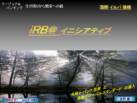
Below two screenshots are from the original
marketing materials that the founder created.
This diagram is the summary of the infrastructure
and business proposition.

You probably notice that the diagram is based on
built-in PowerPoint drawing tool.
Brand new design with firm identify
When I went through the presentation I was able to
follow and could immediately appreciate the venture’s business proposition. The
reason the founder contacted me was he knew I had done numerous technical work for him while we were together at Chase
FX trading. Many of my work was designing and implementing visualization of
trading businesses of one thing or another. He knew his presentation required
upgrades.
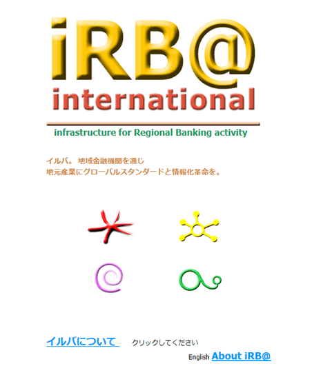
This is the home page I created:
One of the pages in English:
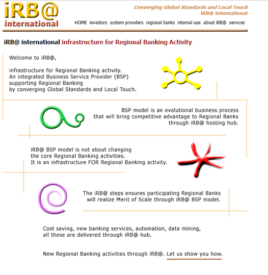
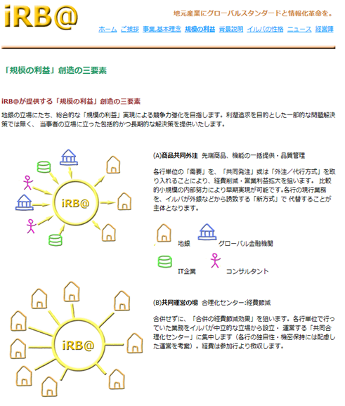
Another page in Japanese;
this page actually explains in steps what the original summary diagram meant to
illustrate (the second screenshot of the original presentation)
The schematics I developed
was applied to all of marketing materials. What made them very happy was the
development of 4 shapes – you might have wondered what these 4 things were on
the home page.
|
|
Once the
venture’s value proposition is understood, this is probably obvious. It
represents infrastructure and hub. |
|
|
The core of banking
is about being an intermediary between lenders and borrowers. Each slash
represents a flow of information and capital. At the center of these three
slashes lies a bank. This logo is to represent traditional regional bank
activities. |
|
|
Each circle
represents a bank’s competitive advantage. Traditionally smaller banks were
no match to bigger ones. The connection between the two suggests what could
be the equal playing field of the two. This is possible if regional banks can
jump-start with an infrastructure that is comparable to large banks. |
|
|
This
represents growth potential for smaller regional banks by realizing the
benefit of the infra services. |


The design process involved deep comprehension of the
business propositions and decomposing to 4 key components. They liked these 4
shapes so much that they printed just these 4 components and hanged on the wall
of their office.
The choice of the color was ultimately done rather
randomly other than to make each one unique. This was because across culture
the same color meant different things and attaching certain meaning with color
seemed rather fruitless.
4 years before Amazon Web Services became available
in 2006 it was a remarkable idea. The business proposition as to how smaller
banks could compete, or jump start FX businesses, is fundamentally the same
idea as how cloud enables startup to have computer infrastructure ready without
up-front huge capital expenditure. Such investment traditionally has been the
barriers to entry for small players. The technical cloud infrastructure itself
is insufficient to do FX trading. There are plenty more setup to be done. The
venture was to cover that aspect as well.
They paid me a modest compensation for the work I had
done but more excitingly shares of the firm.
Business development
They got several rounds of investments and were able
to reach out fair number of regional banks. The founder and couple of the
members were former FX traders and senior managers and thus such development
was not surprising at all.
For the new business model
they applied for a patent in Japan. They actively worked with clients in Japan
and also across South Asia regions for the pilot development. Meanwhile their
home page required only incremental update that they could do themselves. They
remained very happy with my design.
Couple of years later I learned of one of the most
devastating news in my life. The founder – one of the most amazing visionaries
on Wall street technology – passed away suddenly. As far as the venture went, I
did not get to learn the detail of how it ceased to exist, but I imagined that
the loss of him was certainly the biggest reason. Another possibility that
didn’t help was the idea was perhaps 5 to 10 years too early.
The
last update: 8/22/2018
The
page has been designed and written by Ayumi
Ozeki ozekia@gmail.com
go
to home http://ayumi01.s3-website-us-east-1.amazonaws.com